center

Philip Schmökel
<selector1>, <selector2> {
  <property1> : <value1>;
  <property2> : <value2>;
  <property3> : <value3>
}

<selector1> {
  <property4> : <value4>
}

/* Css comment */
/* Example */
p, div {
  background: red;
  font-weight: bold;
  color: blue
}

p {
  font-style: italic
}
| Selector | Selected element(s) |
|---|---|
p |
Paragraphs |
.class1 |
Elements with class1 |
#content |
Element with identifier content |
p.class1 |
Paragaphs with class class1 |
p .class1 |
Elements with class class1 having paragraph ancestor |
.class1 .class2 |
Elements with class class2 having ancestor with class class1 |
p.class1.class2 |
Paragraphs with both class1 and class2 classes |
| Selector | Selected element(s) |
|---|---|
* |
All elements |
div > p |
All <p> elements where the direct parent is a <div> element |
div + p |
All <p> elements that are placed immediately after <div> elements |
p:first-childp:nth-child(3)p:last-child |
Selects every <p> element that is the first/third/last child of its parent |
input[type="text"] |
Selects all <input type="text"> |
Source Ids Classes Elements
| Source | 2 - Inline 1 - <style></style> tag 0 - External file |
| Ids | Number of identifiers in selector |
| Classes | Number of classes in selector |
| Elements | Number of elements in selector |
<div>, <section>, <p><strong>, <i>, <a>, <span><div>
<span>1</span>
<span>2</span><span>3</span>
</div>
<div>
<span>4</span>
<span>5</span><span>6</span>
</div>
<div>
<span>7</span>
<span>8</span><span>9</span>
</div>position: static
position: relative
position: absolute
position: fixed
body {
      position: relative
    }
    .container {
      top: 50px; left: 50px; background: green
    }
    .child {
      top: 50px; right: 50px; background: red
    }
header
center
.content {
    height: 200px;
    position: relative;
    margin-left: 100px;
    background: green;
}
nav {
    width: 100px;
    background: blue;
    position: absolute;
    top: 0;
    left: -100px;
    height: 100%;
}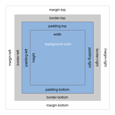
real-size = margin + border + padding + size
you can change what width and height refer to:
box-sizing: content-box|border-box|inherit;
Write CSS and change
to
HTML-file: <Repository>/css/exercises/exercise1.html
Write HTML and create
HTML-file: <Repository>/css/exercises/exercise2.html
... to make CSS more maintainable.
CSS pre-processor
variables, functions, mixins and more
$buttonColor: #2ecc71;
$buttonDark: darken($buttonColor, 10%);
$buttonDarker: darken($buttonDark, 10%);

button {
  background: $buttonColor;
  border-radius: 3px;
  box-shadow: 0px 5px 0px $buttonDark;
  &:hover {
    background: $buttonDark;
    box-shadow: 0px 5px 0px $buttonDarker;
  }
}
... compiles to
button {
  background: #2ecc71;
  border-radius: 3px;
  box-shadow: 0px 5px 0px #25a25a;
}
button:hover {
  background: #25a25a;
  box-shadow: 0px 5px 0px #1b7943;
}
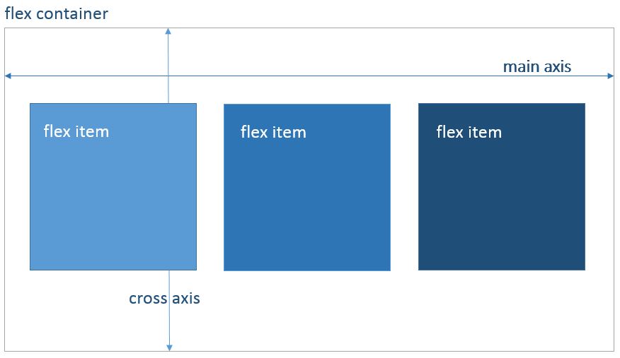
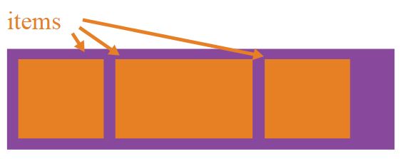
Its all about grouping and aligning container, its flexible items and the space in between
Nestable
Items have equal height by default
Easy responsive layout
Defines the flex container
    .container {
        display: flex; /* or inline-flex */
    }
Direction of flex item appearance
    .container {
        flex-direction: row | row-reverse | column | column-reverse;
    }
Allow items to wrap inside container
    .container{
      flex-wrap: nowrap | wrap | wrap-reverse;
    }
Usage of flex-direction and flex-wrap in one line
    .container {
        flex-flow: <‘flex-direction’> || <‘flex-wrap’>
    }
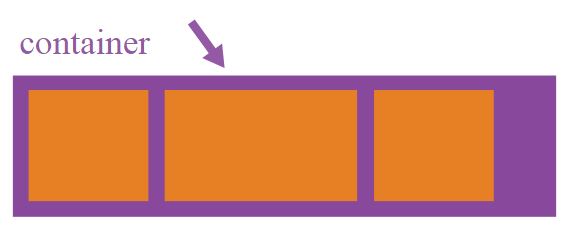
Defines alignment of items and usage of free space between them inside the container along the main axis
    .container {
      justify-content: flex-start | flex-end | center | space-between | space-around;
    }
Defines alignment of container items along cross axis
    .container {
      align-items: flex-start | flex-end | center | baseline | stretch;
    }
Aligns container lines (item rows) in the cross axis, affecting space between lines
    .container {
      align-content: flex-start | flex-end | center | space-between | space-around | stretch;
    }
Defines concrete order of special item inside a container
    .item {
      order: integer;
    }
Overrides the cross axis alignment (align-items) for the individual item
    .item {
      align-self: auto | flex-start | flex-end | center | baseline | stretch;
    }
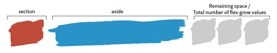
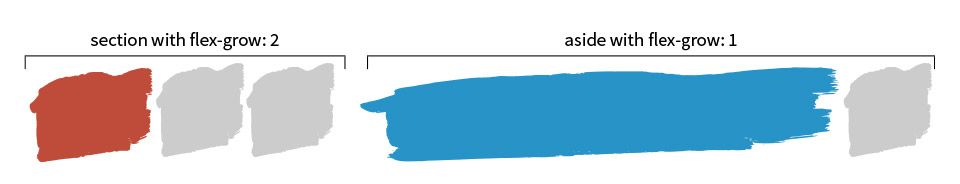
Defines an abilty to grow in proportion to free space
    .item {
      flex-grow: number; /* default 0 */
    }
Defines an abilty to shrink, if no space available
flex-shrink: number; /* default 1 */
Defines the size of the item
flex-basis: length | auto; /* default auto */
Usage of flex-grow, flex-shrink, flex-basis in one line
    .item {
      flex: none | [ <'flex-grow'> <'flex-shrink'>? || <'flex-basis'> ]
    }
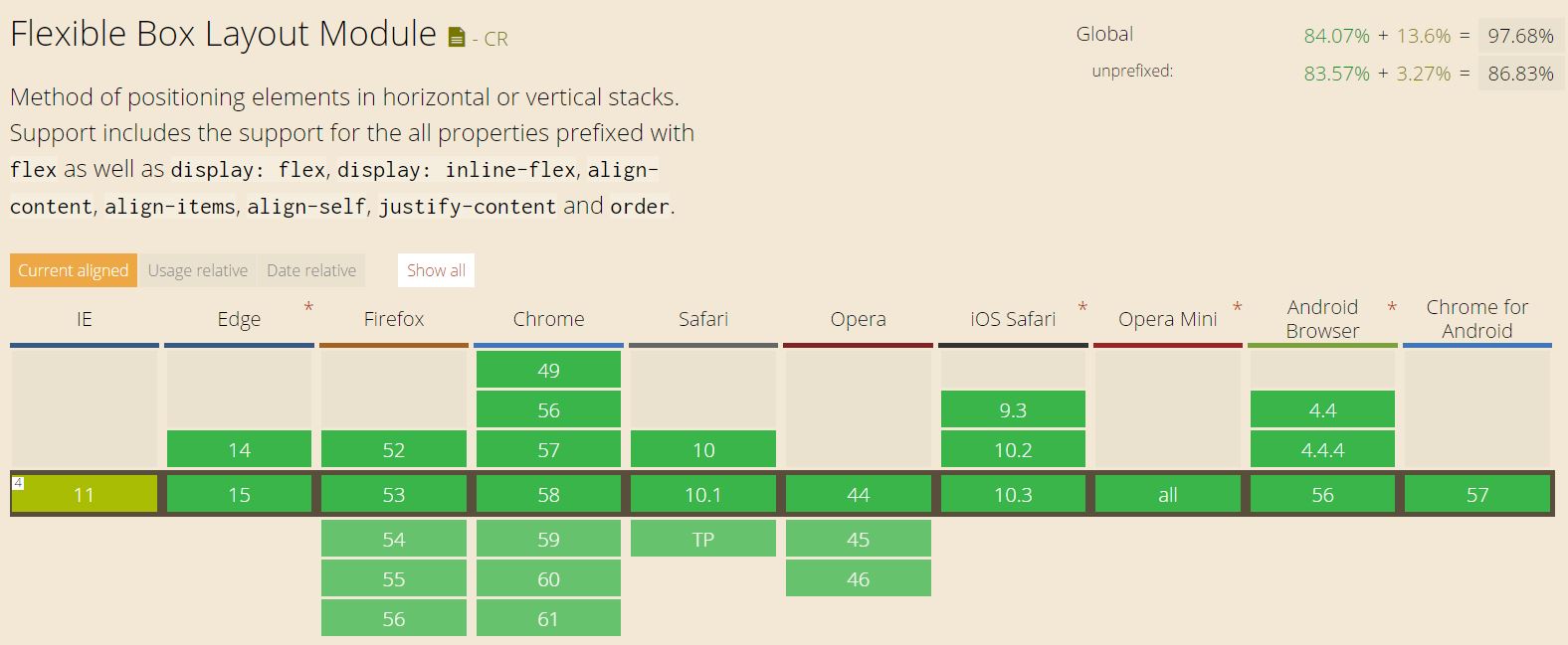
Widely accepted: Can I use..Flexbox?
.. but not without Flexbugs
Write Css code using Flex Model and reproduce.
Use fixed widths for sidebars.
(for small devices (width < 600px) rearrange sidebars to appear above/below content with full width):
HTML-file: <Repository>/css/exercises/exercise3.html